SPEC WORK | WEB & MOBILE USE CASE DESIGN
WEB VS MOBILE LAYOUTS
HOMEPAGE/DASHBOARD
REWARDS
COUPON
MOBILE
SKETCHES
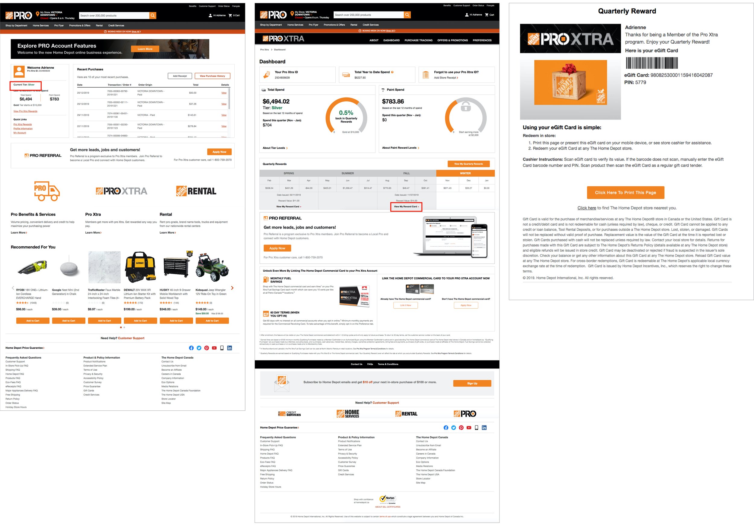
Did you know that Home Depot has a separate website with different products and pricing for contractors? It is called Home Depot ‘Pro Xtra’. It was made for contractors and people in the construction industry to receive rewards, special bulk pricing, exclusive offers, and more. The biggest benefit to signing up is receiving a quarterly reward, in gift card form, based upon how much you have spent in the past 3 months. Currently, the site has a lot of similar layout features to the ordinary Home Depot site, but filled with different content. The Pro Xtra site has a lot to offer if you know how to properly use and navigate it. As someone who has a Pro Xtra account, I find it very difficult to use and navigate but the ordinary site very easy. In this project, I have redesigned the Pro Xtra site and walk you though how to get from the dashboard to your quarterly gift card reward.
I approached this project as Home Depot being my ‘client’ and offering them a realistic user friendly design and cost efficient option that would integrate with their currently site as seamlessly as possible.
Currently, on desktop it takes 2 clicks to get to your reward, and on mobile it takes 4. In my redesign, I have kept the desktop version at 2 steps, but giving the user a much clearer path. On the new mobile version, it now only takes 2 steps for get to your reward, and also making it much easier to navigate there.
Please scroll to the bottom to see current Home Deport designs.
CURRENT SITE


